Guest blogger Karin Dalziel (aka Nirak) has written a nice review of the new Lincoln City Libraries website. She very kindly created a version of her review just for you folks. --ed.
Karin Dalziel is a Master's student in Library and Information Science (that is, she's studying to be a librarian.) As such, she admits that she's a wee bit biased when it comes to the topic of libraries.
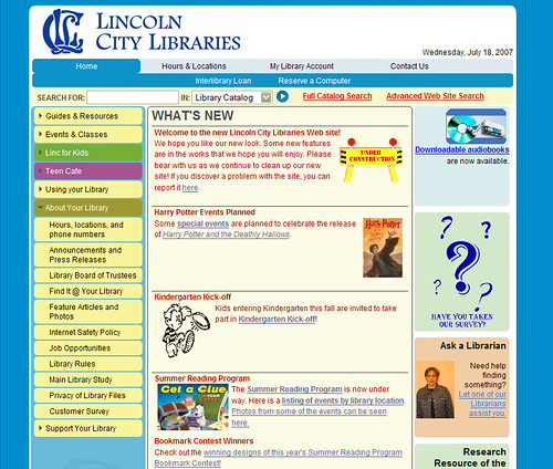
Last week, the Lincoln city Libraries debuted
their new website. I have heard about this website for months now, and was curious what they were up to. I heard rumors of blogs and RSS feeds and web 2.0 content. Dreams of interactivity and public meeting spaces danced in my head. So far, I don't see these new features.

My immediate reactions to the site:
- The new site design breaks some links. The old links for "hours
and locations," "heritage room" "frequently asked questions" and more are broken. Of course, this can be fixed with a redirect, but I question as to why they were changed at all.
- I don't find the site particularly attractive, and at this point, it's somewhat quirky.
- There is a missed branding opportunity. The site is fairly generic, it does not say anything about Lincoln City Libraries.
- There are lots of errors on the page. This is pretty inexcusable when they're so easily found - Most of the errors can be fixed in minutes with a well known programs. While it's true that it can be hard to get rid of all errors, many of these are very simple changes (changing the doctype or case of elements, for instance.).
- The navigation is confusing. Some items are repeated. The expanded lists don't always stay expanded, even when you click in the same section. Many navigation links lift you completely out of the template, which is disorienting.
- The code is just messy. It's a fairly universal rule in (good) web design nowadays to style the HTML elements that are already there whenever possible, rather than adding lots of new classes. This not only makes the code leaner (and faster loading) but it has a host of accessibility advantages.
These are all little things, in of themselves, but they add up to a disorienting experience for the user. Today's Internet users have
little patience for such frustrations, and will go somewhere else rather than put up with them.
Where are the new features?
Quick Connect Web Services, the company hired for the redesign, has an
impressive list of new features:
- Add, edit, and delete pages whenever they need to using an online text editor similar to Microsoft Word
- Each page can have a different template using any of the three templates we developed for each section of their site
- Pages can be public, or protected so only staff can see them
- Organize content into categories and with tags
- A customized blogging platform
- Visitors can comment on blogs and the comments are "threaded" to facilitate discussion
- Promote books on different sections of the site
- RSS Feeds for their blogs
- Update their site navigation
It's a very nice list, but I hardly see any of this. I can't find an RSS feed or a blog. I have seen a few email forms, but nowhere can I leave a comment. I'm not sure if the tagging of content refers to the front end (users) or back end- it sounds like a great concept, though.
In the end, this site looks exactly like what it is- the same old site, shoved into a new design. Very little thought has been paid to the content, navigation, usability, or what the user will actually use the site for. There's no integration with the ILS (which I realize is a whole other beast and outside the aims of the project, but there's not even the illusion of integration- you're taken to a completely new site).
More than anything, I'd like to see some transparency as to the goings on in thelibrary. At the
Ann Arbor District Library, there are several blogs aggregated on the main page, and people can comment on the posts. What's amazing is, the libraries respond! Take a look at this
blog post about Ann Arbor's new website, and the long list of comments that follow. The truthfulness is something that's great to see in a public institution.
Suggestions for improvement
Why should I care if the Lincoln City Library has rolled out a nice, generic website? Because I see the potential for much more. Much of the potential is not lost- with some tweaks, the current website design can work. Here are my suggestions for an improved user experience.
- Carefully consider navigation - every links does not need to be on the side navigation.
- Get rid of clip art, add photos.
- Add interactivity - make blogs, enable comments. Give the public a way to interact other than an email form.
- Adjust the colors - brighter is not always better!
- Add redirects to fix broken links.
- Try to integrate the book search into the site. (Right now, you're taken to a new page, out of the template)
- Add pictures/bios of staff - I realize not all staff will want this, but maybe some will, and they can set an example.
- Add multimedia - utilize free services to put video content up.
My redesign
Here's an idea of what an alternative website might look like - slightly subdued colors, more photos, picture of the library across the top. This is just an idea of an alternative, it is by no means what I think the site should look like. (Also, I didn't spend too long on this, just tried to flesh out some ideas)

Image credits:
Questions for you
What do you think? Is the new website just fine the way it is? Do you even care about the library? Would blogs and RSS feeds interest you at all?
