The New Lincoln City Libraries Website: A Review
By: Mr. Wilson on
July 25, 2007
Karin Dalziel is a Master's student in Library and Information Science (that is, she's studying to be a librarian.) As such, she admits that she's a wee bit biased when it comes to the topic of libraries. Last week, the Lincoln city Libraries debuted their new website. I have heard about this website for months now, and was curious what they were up to. I heard rumors of blogs and RSS feeds and web 2.0 content. Dreams of interactivity and public meeting spaces danced in my head. So far, I don't see these new features.
My immediate reactions to the site:
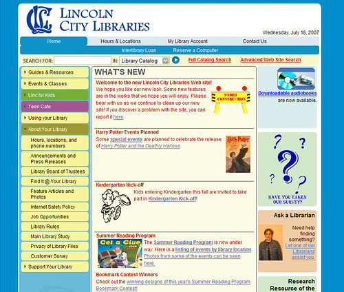
- The new site design breaks some links. The old links for "hours and locations," "heritage room" "frequently asked questions" and more are broken. Of course, this can be fixed with a redirect, but I question as to why they were changed at all.
- I don't find the site particularly attractive, and at this point, it's somewhat quirky.
- There is a missed branding opportunity. The site is fairly generic, it does not say anything about Lincoln City Libraries.
- There are lots of errors on the page. This is pretty inexcusable when they're so easily found - Most of the errors can be fixed in minutes with a well known programs. While it's true that it can be hard to get rid of all errors, many of these are very simple changes (changing the doctype or case of elements, for instance.).
- The navigation is confusing. Some items are repeated. The expanded lists don't always stay expanded, even when you click in the same section. Many navigation links lift you completely out of the template, which is disorienting.
- The code is just messy. It's a fairly universal rule in (good) web design nowadays to style the HTML elements that are already there whenever possible, rather than adding lots of new classes. This not only makes the code leaner (and faster loading) but it has a host of accessibility advantages.
Where are the new features?
Quick Connect Web Services, the company hired for the redesign, has an impressive list of new features:- Add, edit, and delete pages whenever they need to using an online text editor similar to Microsoft Word
- Each page can have a different template using any of the three templates we developed for each section of their site
- Pages can be public, or protected so only staff can see them
- Organize content into categories and with tags
- A customized blogging platform
- Visitors can comment on blogs and the comments are "threaded" to facilitate discussion
- Promote books on different sections of the site
- RSS Feeds for their blogs
- Update their site navigation
Suggestions for improvement
Why should I care if the Lincoln City Library has rolled out a nice, generic website? Because I see the potential for much more. Much of the potential is not lost- with some tweaks, the current website design can work. Here are my suggestions for an improved user experience.- Carefully consider navigation - every links does not need to be on the side navigation.
- Get rid of clip art, add photos.
- Add interactivity - make blogs, enable comments. Give the public a way to interact other than an email form.
- Adjust the colors - brighter is not always better!
- Add redirects to fix broken links.
- Try to integrate the book search into the site. (Right now, you're taken to a new page, out of the template)
- Add pictures/bios of staff - I realize not all staff will want this, but maybe some will, and they can set an example.
- Add multimedia - utilize free services to put video content up.
My redesign
Here's an idea of what an alternative website might look like - slightly subdued colors, more photos, picture of the library across the top. This is just an idea of an alternative, it is by no means what I think the site should look like. (Also, I didn't spend too long on this, just tried to flesh out some ideas) Image credits:
- flickr.com/photos/frogmuseum2/192590334/
- flickr.com/photos/joshb/21466216/
- flickr.com/photos/dashka/393977876/
- flickr.com/photos/travelinlibrarian/478279594/
Comments
See what your friends and neighbors have to say about this.
I didnt know about that firefox extension. Thanks! I really like your build of the page. Blogs by the library staff about books of the month, or thematically similar authors could be nice. RSS maybe not so much unless they have someone on staff with the time to create content.
Thanks Karin, for the analysis. I agree with your review. And I can’t emphasize enough how nice it would be to have a library blog.
Chief Casady has set the new gold standard (until someone does it better) here in Lincoln when it comes to providing insight about the inner workings on of public office. For those of us who use the library heavily (and I am one of them) it would be nice to have a similar feature.
As it stands now, they still have library board meeting minutes available, but I would love to see more interactivity here. Also, although I initially thought that staff photos and bios may just be clutter, now I think its a really good idea. I go to the library almost every day and I would enjoy knowing more about the staff because in my experience at least - they have always been universally helpful and friendly folks I wouldn’t mind knowing more about.
I wonder why they didn’t have a “new books of the month” section featuring recent titles they have acquired?
Additionally, adding that photo at the top there makes a world of difference. It makes the site look a lot more professional and less kiddy.
Excellent improvements!
Now can someone please give them a new logo?
My wife and I were on the site last weekend, and my wife’s reaction was - “WTF?” All I could say was, well, I don’t like it either, but it seems like a step in the right direction. A baby step, but a step.
I like Karin’s changes, and agree with her wholeheartedly on what they COULD/SHOULD be doing. Her review is right on.
Karin mentioned this in passing, but it is more important to me - the catalog and account system is the number one reason I use the site. It took me FAR too long to even find it, and then it takes me to the same old functional ugliness. If people are spending the bulk of their time interacting with this one tool, wouldn’t they want to make it real pretty?
I am happy to see recently that when you are using Google Books, the “Find this book in local libraries” link does work with Lincoln City Libraries now. That’s nice!
I agree completely about the catalog- but I know that changing that is much harder than the website. I don’t know how the current system works, or how easy it is to change the style - I’m guessing it’s not easy. (If you look at the code for the catalog screen, you’ll see what I mean - yech.)
There’s an ongoing debate in the library world right now about the catalog system- about how it’s generally not user friendly and geared more towards librarians than the public. The problem is, the systems cost a LOT (from what I have hear, in the neighborhood of $300-$500k at LEAST) so once a library has locked into one, they are stuck until they really need to upgrade- because that’s the only time they can justify the expense.
There is hope though. There are now several open source catalog programs- and though they’re still expensive (you have to hire people to install, maintain, and transfer data to them) they are much better than many of the old systems. And the commercial catalogs are wising up- the next generation of these systems have many new and very nice features.
The Ann Arbor District Library (http://www.aadl.org/catalog) I mentioned above has set a new standard- Their catalog has tagging, reviews, and better searching capabilities than almost all the others. They also have a “users who checked out this also checked out that” feature which is really great. They accomplished this by hiring very talented programmers (one in particular)- hopefully other libraries follow their lead.
I, personally, would like to see a move away from every library having their own catalog. Seems like a waste of resources, and it makes it hard to compete with the likes of Amazon. There are trends in this as well, it’ll be interesting (for geeks like me) to watch.
Share your thoughts with the community.
Commenting is no longer permitted on this post.